
Sunday, March 31, 2013
Tuesday, March 19, 2013
Let's Celebrate With a Giveaway!
My blog is coming up on 5,000 total hits. Yes, I know that is a blip on the blogosphere. And probably 4,993 of those hits will be me checking to see what the blog looks like. :-)
But seriously, 5,000 hits is a personal milestone for me, because... it's a nice round number. Yeah. And it's way better than 500, which is where my blog hovered for quite some time.
So, what better way to celebrate this milestone, however infinitesimal, than with a giveaway? But not just any giveaway. A personalized giveaway.
If you have been reading the blog lately (and of course you have... where do you think those 5,000 hits came from?), you know that I have recently been highly enamored of calligraphy and envelopes and mail. I made myself the following monogram, using a Zebra Comic G nib and Sumi Moon Palace ink on HP premium laser printer paper:

Then I scanned it at 1200 dpi and saved it as a JPEG. Now I can use it as clip art, essentially, on my own personalized letterhead, or labels, or notecards -- anything my little brain can think up. And this makes me happy. I also cropped the H out and made this tonight:

This all got me to thinking: there are probably a few of you out there that might like the same thing. With your own initials, of course, not mine.
So that's going to be the giveaway. The winner will get the services of me and my pen to create a one-of-a-kind, personalized calligraphy piece (in copperplate, as shown above, or italic, or what I like to call my "funky copperplate" hand). I will let you decide what it will be exactly. Then I will scan it at high resolution and email the file to you for your own use as clip art on anything you wish. It will be my gift to you!
And the rules are simple: leave a comment below, in the comments section, and you're entered. This is not a high-traffic blog (ya think??!), so I'll leave the giveaway open for roughly 10 days or so, until the end of March. Then on April 1, I and my friendly neighborhood random number generator will pick a winner. I'll announce the winner here, and if the winning comment is associated with an email, that person will be hearing from me shortly thereafter. If not, the winner will have to email me instead. But we're going to keep this as simple as possible.
Good luck!
Saturday, March 16, 2013
Happy JetPens Day!
Happy JetPens Day! Yes, it's a holiday anytime one receives an order from JetPens -- and I received the contents shown here yesterday, my latest order from this awesome company.
I am sure I will be reviewing at least some of these products in the future, but for now let's just bask in their awesomeness (am I using the word "awesome" too much? Well, it's JetPens -- what other word is there??):

From left to right:
A 10-pack of Zebra Comic G nibs -- by far my most favorite nib for calligraphy (copperplate, etc.), and since the wedding invitations are not yet finished, I will likely need to break this open sometime in the near future.
A Clairefontaine Triomphe writing paper pad -- for letters!
A Uni-Ball Signo 0.7mm white ink pen -- been lusting after this one for quite some time.
A Uni-Ball Signo Broad white ink pen
A Pilot Juice gel ink pen, 0.5mm in blue/black -- also an object of (now-satisfied) lust!
Thursday, March 14, 2013
Review: Bic Cristal 1.6 mm Pens
For a few years now, pen manufacturers have been making broader pen points than 1.0 mm, which for a long time used to be the most standard nib size (I am guessing) commonly available. Of these larger sizes that started appearing in the stores, 1.4 mm and 1.6 mm seem to be the most common. (I don't recall ever seeing a 1.2 mm nib. Do they exist? Would they be that much different from 1.0 to be able to tell any difference at all? Inquiring minds, etc. etc.) I would look at these pens and think, "Who in the world would want to write with that chunky thing?" And then I would buy them. And try them. And generally not care for them, so the answer to my question would be, "Not me, obviously."
However, hope springs eternal, and I keep buying and trying these types of pens. I want to like them, but somehow they never seemed quite right. Until now.
A week or so ago, I bought a pack of Bic Cristal pens in all different colors, and part of the reason these caught my eye was that they were 1.6 mm pens. (I believe these are called the Bic Cristal "Bold" pens. I should have saved the packaging, but I didn't expect to be writing this review!) This was a little bit of a turn-off due to my past experience with this size nib, but I really liked some of the colors in the pack, so I thought they were worth taking a chance.
Here's my verdict after writing with them for several days: I don't know if it's the ink in the pens (just typical Bic ballpoint ink, as far as I can tell -- someone correct me if I'm wrong), or the 1.6 mm nibs, or some magical pen fairy dust they have sprinkled in these pens, but MAN are they SMOOTH. The pens literally glide across the page, and although they have a tendency to be a little "blobby" as many of these types of pens do, a little blobbiness is never a deal breaker for me.
Stylewise, these are typical Bic Cristal pens, with all the classic design features that we all know and love (OK, that I know and love -- you might hate Bic pens but I for one associate them with my childhood; they were one of my top go-to pens as a kid). Caps, barrels, stamped logo -- it all screams "Bic!!"


In addition to the smoothness of these pens, the ink itself also seems to be more vibrant and intense than other Bic pens I have tried. While this certainly could be due to the simple fact that the 1.6 mm tip is laying down more ink pigment on the page, it does make me wonder if this is a new or special formulation of ink.

However, hope springs eternal, and I keep buying and trying these types of pens. I want to like them, but somehow they never seemed quite right. Until now.
A week or so ago, I bought a pack of Bic Cristal pens in all different colors, and part of the reason these caught my eye was that they were 1.6 mm pens. (I believe these are called the Bic Cristal "Bold" pens. I should have saved the packaging, but I didn't expect to be writing this review!) This was a little bit of a turn-off due to my past experience with this size nib, but I really liked some of the colors in the pack, so I thought they were worth taking a chance.
Here's my verdict after writing with them for several days: I don't know if it's the ink in the pens (just typical Bic ballpoint ink, as far as I can tell -- someone correct me if I'm wrong), or the 1.6 mm nibs, or some magical pen fairy dust they have sprinkled in these pens, but MAN are they SMOOTH. The pens literally glide across the page, and although they have a tendency to be a little "blobby" as many of these types of pens do, a little blobbiness is never a deal breaker for me.
Stylewise, these are typical Bic Cristal pens, with all the classic design features that we all know and love (OK, that I know and love -- you might hate Bic pens but I for one associate them with my childhood; they were one of my top go-to pens as a kid). Caps, barrels, stamped logo -- it all screams "Bic!!"

And even the ballpoint looks typical -- except for that seemingly impossibly huge ballpoint. But I think that is definitely the secret of this pen's success. The ballpoint comes with a small blob of wax affixed, to keep the pen from drying out before a writer gets to it. That is not something I associate with Bic pens -- and it's certainly something associated more with gel pens than with regular ballpoint ink -- but I suppose it's necessary for keeping the ink from drying out on such a broad point.

In addition to the smoothness of these pens, the ink itself also seems to be more vibrant and intense than other Bic pens I have tried. While this certainly could be due to the simple fact that the 1.6 mm tip is laying down more ink pigment on the page, it does make me wonder if this is a new or special formulation of ink.

At any rate, these pens are fantastic and I highly recommend them. And they give me hope for the 1.6 mm nib!
Wednesday, March 13, 2013
Yet Another Envelope Style
This one is a little more finicky because the name has to be centered and the ink of the address has to be black enough to match the intense black of the Sumi Moon Palace ink I use with the pointed pen for the name. But I think it's fun and striking.


Monday, March 11, 2013
Incoming!
Like a trickle at first...

Then a few more drops...

And now a flood! Boy, is my mailbox happy these days!
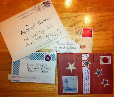

Then a few more drops...

Love this envelope from PostMuse, by the way -- made out of a page from the USPS stamp catalog!
And now a flood! Boy, is my mailbox happy these days!

Another Envelope Style
I have discovered that one of my favorite things to do is to look for and develop interesting methods of addressing envelopes using my calligraphy skills and pens. So, here's another one I have been experimenting with and using lately.

If you're one of my penpals, you might see this kind of thing in your mailbox sometime. If you're not my penpal yet, you know how to fix that!

If you're one of my penpals, you might see this kind of thing in your mailbox sometime. If you're not my penpal yet, you know how to fix that!
Subscribe to:
Posts (Atom)